Building Plug & Play Components
I wrote before about letting customers define their own data. That article covered the backend: the schema catalog, the JSONB storage, the validation. This one covers the half that was actually harder to design: the frontend.
Custom fields have a brutal UI requirement. The same fields must show up everywhere: on an asset drawer, inside a risk profile, in a filter panel, in a create form, in a table. Dozens of pages, owned by different teams, each with its own queries and layout. If adding custom fields to a page takes real work, teams will do that work slightly differently every time, and you end up maintaining ten diverging copies of one feature.
So the real design problem was: how do you make custom fields a plug and play component, something any team drops onto any page and it just works? I gave a talk about the philosophy at Sprinto. This article is that deck in prose. (This engine scaled from small orgs to enterprises, and none of the design below is specific to custom fields.)
What plug and play means
Three properties, and you need all three:
- Composable. It fits into an existing page as a building block. No rework of the page around it.
- Isolated. Self-contained. It fails safely without breaking the rest of the page, and the page never worries about how it works inside.
- Extensible. It adapts to new needs through hooks and extension points, not by forking. Forks are how one feature becomes ten fragments with slight variations.
Why the usual way fails
The usual way to add a cross-cutting feature to a page: extend the page query by hand, drill the data down through props, and copy the getters from the last page that did it.
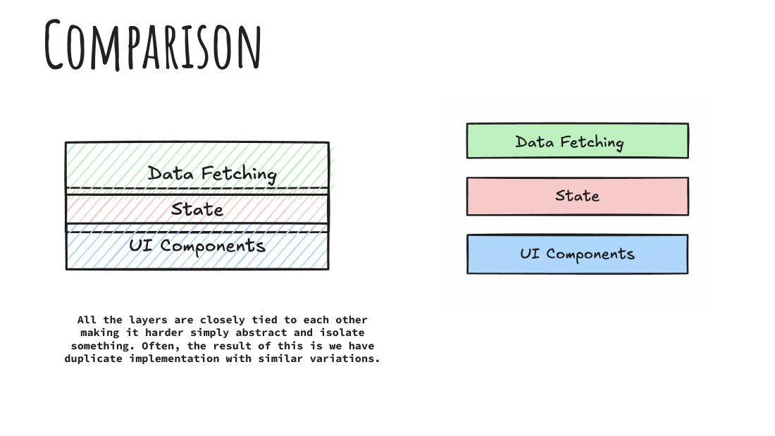
The problem is that all the layers are tied together. Fetching, state, and UI are one braid, so you cannot abstract or isolate any single strand. Every new page re-implements the braid with small variations. Hard to maintain, no separation of concerns, and the duplicates drift apart over time.
The architecture: three layers, three decouplings
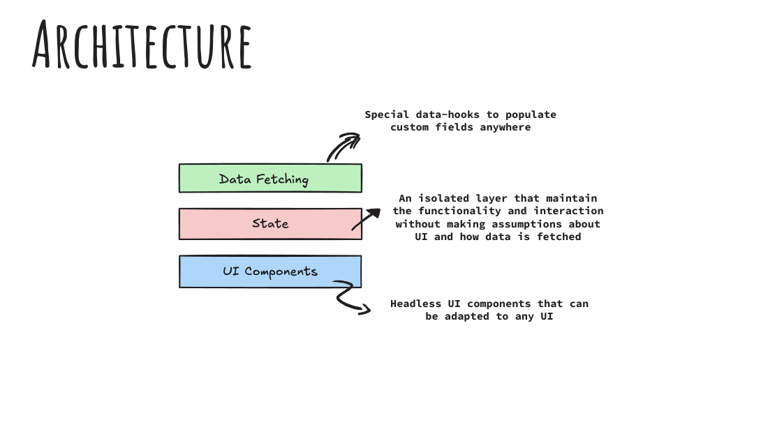
Data fetching: one hook, one context. A single reusable data hook fetches custom fields, and a shared context provides them. Any component on the page consumes from context directly. Nobody rewrites queries, nobody drills props, and the getters come built in instead of being copied from the last implementation.
State: the isolated middle. A layer that encapsulates how the data is transformed and managed for rendering, and it makes two promises. It assumes nothing about how the data was fetched, and it leaks nothing about custom fields into the UI. This is the layer that keeps the other two honest.
UI: headless components. The interaction logic ships without a fixed look, so it adapts to any surface. A drawer, a form, a filter panel, and a table all reuse the same behavior with their own rendering.
The rule underneath all three: every layer must be replaceable without touching the other two. That is the whole discipline. The three properties (composable, isolated, extensible) fall out of it.
What it buys you in the product
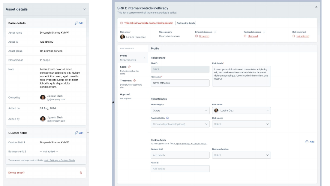
Once the layers exist, “add custom fields to this page” stops being a project. A team mounts the provider, drops the component into their layout, and the fields render, edit, and filter the same way they do everywhere else. Consistency is not enforced by review. It is the path of least resistance.
The honest limitations
Plug and play is not free, and the deck said so:
- Consumer components still own their loading and error states. The engine will not guess what a half-loaded drawer should look like on your page.
- The starter utilities are thin. Getting the separation of concerns right still demands care from the developer; the architecture makes the right thing possible, not automatic.
Takeaway
A pluggable component is not a component with lots of props. It is three decouplings: fetching from state, state from UI, and the feature from the pages that host it. Get those boundaries right once, and every page after that gets the feature nearly for free.