
How calibre-zen works
The design, for people who know calibre and want to understand it without reading the code. One idea, applied in a few places.
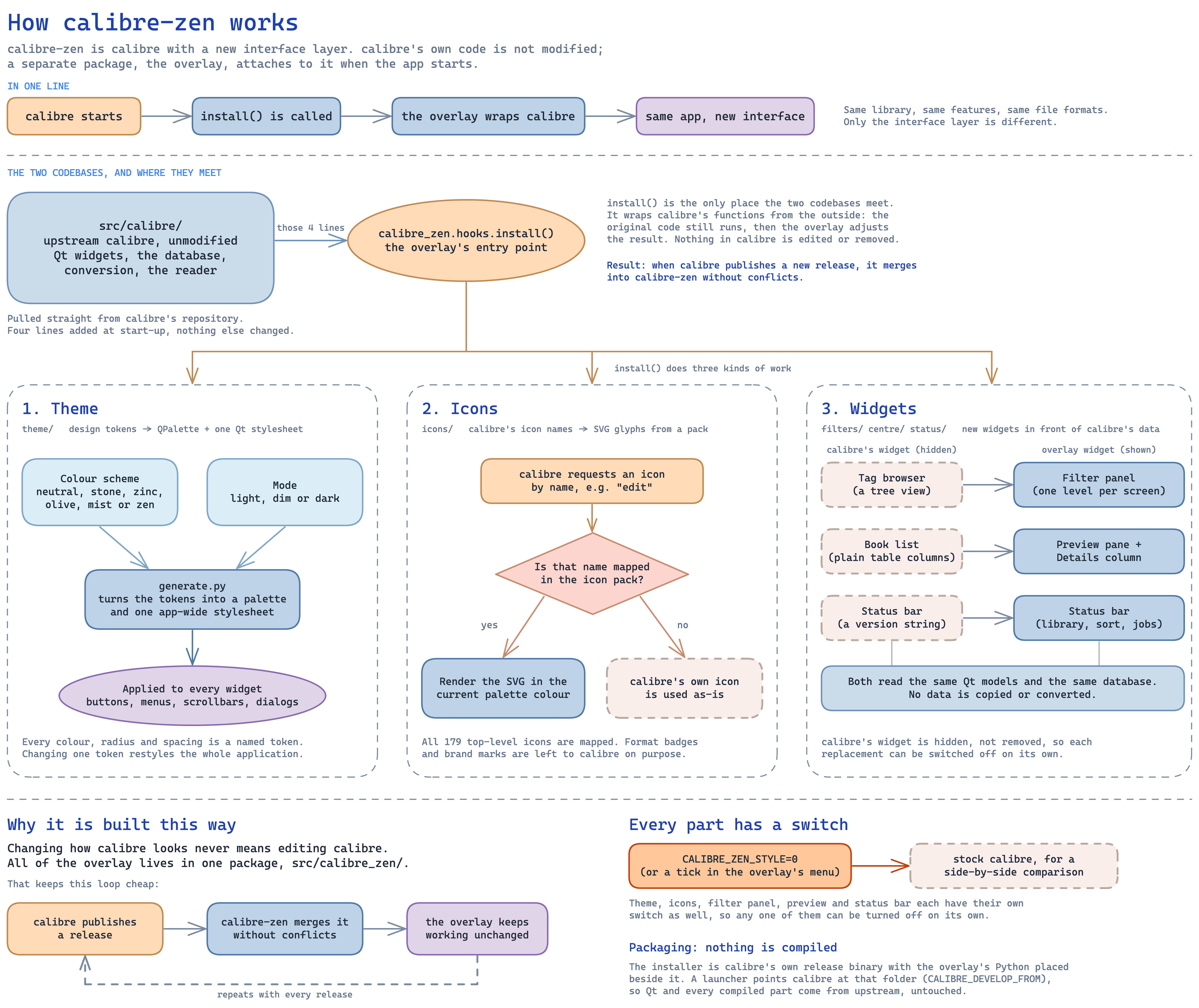
Click the diagram to open it at full size.
The short version
Section titled “The short version”calibre-zen is calibre with a new interface layer on top. calibre’s own code is left alone. A separate package, called the overlay, attaches to calibre when the app starts. Same library, same features, same file formats. Only the interface is different.
Two codebases, one meeting point
Section titled “Two codebases, one meeting point”The repo has two folders that matter.
src/calibre/ is calibre, pulled straight from calibre’s own repository. We add four lines to it at start-up and change nothing else.
src/calibre_zen/ is the overlay. Everything we build lives here.
Those four lines call one function, calibre_zen.hooks.install(). That is the only place the two codebases touch.
The main idea: wrap, do not edit
Section titled “The main idea: wrap, do not edit”This is the most important point in the document: install() never edits calibre. It wraps calibre’s functions from the outside. Take the function in calibre that sets the app’s stylesheet. We do not rewrite it. We put our own function around it. calibre’s function runs like normal, then ours steps in and adjusts the result.
The reason is upkeep. calibre ships new versions often. If we edited calibre’s files, every update would conflict with our changes. Because we only wrap, a new calibre release merges into calibre-zen cleanly and the overlay keeps working. This is what lets a small project track a large one over time.
What install() does
Section titled “What install() does”install() does three kinds of work: the theme, the icons and the widgets.
1. The theme
Section titled “1. The theme”Every colour, corner radius and bit of spacing is a named token. A colour scheme picks the base colours. There are six: neutral, stone, zinc, olive, mist and zen. A mode picks light, dim or dark.
A script called generate.py reads those tokens and produces two things: a Qt palette, and one stylesheet for the whole app. That stylesheet reaches every widget. Buttons, menus, scrollbars and dialogs all come from the same source.
The result is that changing one token restyles the whole app. There is no second place where a colour is written down.
2. The icons
Section titled “2. The icons”calibre asks for icons by name, for example “edit” or “trash”. We wrap that request.
If the name is mapped in our icon pack, we render an SVG glyph in the current palette colour, so icons match the theme in both light and dark.
If the name is not mapped, calibre’s own icon is used as is. An icon pack therefore never has to be complete. Today all 179 of calibre’s top-level icons are mapped. Format badges like EPUB and PDF, and brand logos, are left to calibre on purpose.
3. The widgets
Section titled “3. The widgets”This is where the overlay goes past colours. Three parts of calibre’s window are replaced with our own widgets.
- The tag browser is a large tree view. We hide it and show a filter panel, one level per screen.
- The book list is a plain table. We add a preview pane above it and a single Details column that shows cover, title and the rest together.
- The status bar showed a version string. Ours shows the library, the sort order, the content server and background jobs.
Two rules hold for all three. Our widgets read the same Qt models and the same database as calibre’s, so no data is copied or converted. And calibre’s widget is hidden, not removed, so each replacement can be turned off on its own.
Of the three kinds of work, this one carries the most risk. A wrong colour only looks wrong. A replaced widget can behave wrong. More on that at the end.
Every part has a switch
Section titled “Every part has a switch”Set CALIBRE_ZEN_STYLE=0 and stock calibre comes back. This is how we take side-by-side screenshots. The same switch is a tick box in the overlay’s menu.
The theme, icons, filter panel, preview and status bar each have their own switch too. Turning one off brings back calibre’s original piece in that spot, with everything else still in place.
Packaging: nothing is compiled
Section titled “Packaging: nothing is compiled”We never build calibre. The installer is calibre’s own release binary with our Python folder placed beside it. A small launcher points calibre at that folder through CALIBRE_DEVELOP_FROM. Qt and every compiled piece come straight from upstream, untouched. We add only Python, stylesheets, SVGs and fonts.
This matters for trust as well as effort. The binary a user runs is the one calibre published.
Where it can get better
Section titled “Where it can get better”Three areas stand out.
Parts that paint themselves. Some calibre views draw with custom paint code, and the stylesheet cannot reach them. The cover grid and the bookshelf view are the two big ones still in stock form. They will need the same treatment as the tag browser and the book list: a widget of our own, or a delegate in front of calibre’s widget.
Testing the widget swaps. The three replaced widgets are the one place a calibre update could change behaviour under us rather than looks. Headless tests around them would make each upstream merge safer to accept.
More packs. The plumbing for icon sets, fonts and colour schemes already exists. Adding one is mostly a matter of mapping names and dropping in files, so this is a good first contribution.
That is the whole design. One entry point, wrapping instead of editing, and a rule we hold to: change how calibre looks without ever editing calibre.